The kitchen is the heart of the home. Used everyday, we cook, eat, socialise, work, plan and gather in our kitchens.
Our kitchen at home is one of the smallest rooms in our house. It is long and thin – a galley style – but has to accommodate two adults, two children, and a dog. When planning our kitchen there were a few essentials that we really couldn’t do without: we needed a double oven and a large hob, a decent sized sink and draining board, storage, a bit more storage, and as much worktop space as we could squeeze in.
It can also become cluttered easily – we have coffee machines, a microwave, toaster, kettle, storage jars (there really is no point in hiding away tea, coffee and sugar jars – the kettle is always on), utensils and endless other ‘kitchen stuff’. By keeping the units, floor and worktops as similar coloured tones of one another, we hoped to provide a fuss-free colour scheme that would create the illusion of space, even if there wasn’t a spare inch. The worktop was key to this.
We were always going to choose granite worktops. Not just because we work with it everyday, but because of the unique characteristics it could bring to our kitchen.
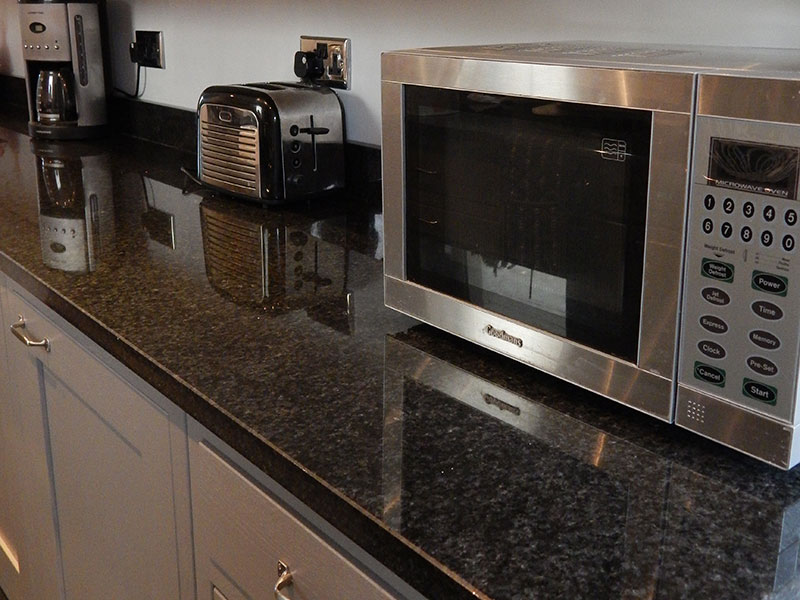
We chose a granite called Pearl Black. Each slab is unique – full of subtle dark grey mottles and flecks, that provide a depth and texture to the surface, giving the worktop, and the kitchen, character. It is our ‘wow’ statement. Even though our kitchen is small and functional, we still wanted a feature that would have impact. We get all of this in the granite; function, durability and style.
It is a highly polished surface, so it reflects the light well. This was also important for us. It’s a small room and we used the worktop to create the illusion of light and space. We kept the cupboards off the worktop and used upstands to help accentuate the length of the worktops, and the kitchen. We also installed a butler sink with draining grooves cut into the worktop to help extend the length.


Recent Comments